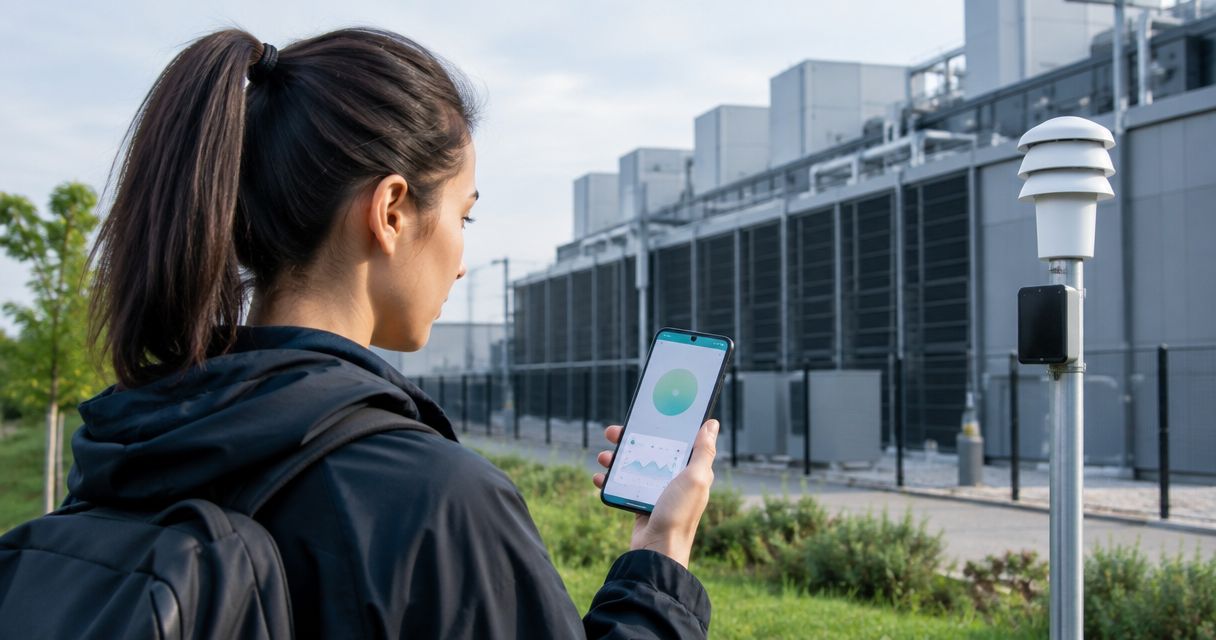
Best overall: AirNow. Best for nearby particle readings: PurpleAir. Best for routine air-quality checks: IQAir AirVisual. Best for wind context: Windy. The best apps to track air quality near data centers in 2026 help you compare conditions; none establishes that a particular facility caused the pollution you see.
- AirNow leads the best apps to track air quality near data centers for regional AQI checks.
- PurpleAir adds nearby particle readings; check sensor placement and correction settings before comparing results.
- IQAir AirVisual suits routine checks, while Windy adds wind context rather than proof of emissions.
- DYORUSA is best for residents seeking independent education about data-center community impacts, not an air-monitoring app.
Why this matters
A colored dot on a map answers a limited question: what does this monitor, estimate, or forecast report for this location? It does not identify the source. Traffic, wildfire smoke, construction, and other combustion sources belong in the same investigation as a nearby data center.
DYORUSA provides independent research and public education about data-center community impacts. Its role here is to help you distinguish a useful observation from an unsupported accusation.
For a 2026 neighborhood review, start with the pollutant, location, and timestamp—not the app with the most alarming color. A regional reading and a sensor beside your home describe different places. Neither automatically describes the air at a facility boundary.
What makes the best air-quality tracking apps
Choose tools against these criteria before treating their readings as evidence:
- Data origin: Can you tell whether the displayed value comes from a regulatory monitor, a community sensor, or a forecast model?
- Pollutant coverage: Does the tool measure the pollutant you are investigating? Particle readings do not establish nitrogen dioxide concentrations.
- Local relevance: Can you identify the reporting location rather than assume the nearest city reading represents your street?
- Time alignment: Can you match the reading with the time of an odor, visible activity, or other reported event?
- Measurement limits: Does the display let you distinguish measured concentrations from an AQI category or modeled estimate?
- Context: Can you compare nearby locations and weather instead of interpreting one isolated reading?
The best setup combines a regional baseline, a nearby particle reading, and weather context. Adding more apps is useful only when they add different information—not when they repeat the same underlying observation.
Air-quality tools at a glance
This 2026 ranking compares complementary roles. PurpleAir is included as a browser-based sensor map; you do not need a conventional mobile app for a tool to be useful on your phone.
| Rank and tool | Best for | Standout feature | Key limitation |
|---|---|---|---|
| 1. AirNow | Regional AQI baseline | Public air-quality reporting from participating monitoring agencies | Regional conditions do not establish exposure at your property |
| 2. PurpleAir | Nearby particle comparisons | Map of individual community particle sensors | Sensor placement and environmental conditions affect interpretation |
| 3. IQAir AirVisual | Routine location checks | Location-based air-quality information | A city summary is not a measurement at a data-center fence line |
| 4. Windy | Wind and transport context | Weather maps alongside modeled air-quality layers | A forecast layer is not a local pollutant measurement |
1. AirNow: best air-quality app for a regional baseline
AirNow presents air-quality information reported through participating monitoring agencies. Its AQI reporting focuses on ozone and particle pollution, making it a practical starting point for understanding broader conditions before examining a neighborhood sensor.
Use AirNow first when you need to know whether a poor reading coincides with a wider regional episode. Then inspect the reporting area and timestamp. A regional AQI summary is context, not a substitute for a measurement at your address.
AirNow pros:
- Provides a public-agency baseline for air-quality checks.
- Uses the established US Air Quality Index framework.
- Helps separate a neighborhood question from broader pollution conditions.
- Gives residents and policymakers a common reference for discussing AQI.
AirNow cons:
- Regional reporting does not resolve every street or property boundary.
- AQI reporting does not identify the facility responsible for pollution.
- Its main AQI pollutants do not answer every question about generator emissions or odors.
Best for: Residents who need an understandable regional starting point before investigating a local concern.
For your 2026 monitoring routine, record the reporting location as carefully as the AQI. If you compare a neighborhood sensor with AirNow, explain that the instruments and locations differ. Agreement supports a broader pattern; disagreement requires investigation, not an immediate conclusion.
Verdict: Hold any claim of data-center causation; choose AirNow as your regional baseline.
2. PurpleAir: best air-quality tool for nearby particles
PurpleAir displays readings from individual particle sensors on a public map. Its main value is spatial detail: where participating sensors exist, you can compare particle conditions closer to the places residents actually spend time.
That detail comes with a responsibility. Check whether the sensor is indoors or outdoors, examine its location, and use consistent display settings when comparing readings. A precisely located sensor is not automatically a precisely characterized neighborhood exposure.
PurpleAir pros:
- Shows individual sensor locations rather than only city summaries.
- Supports comparisons among nearby particle readings.
- Adds local context where participating outdoor sensors exist.
- Helps you identify observations that deserve a closer look.
PurpleAir cons:
- Community sensor coverage depends on where people install sensors.
- Optical particle readings are affected by humidity and require appropriate interpretation or correction.
- Particle sensors do not identify the chemical source of a pollution event.
Best for: Residents comparing outdoor particle conditions across nearby locations.
PM2.5 describes particles with diameters generally 2.5 micrometers or smaller. It is a pollutant category, not a fingerprint for diesel exhaust or data-center activity. A rise in PM2.5 tells you to examine conditions and other evidence; it does not tell you who caused the rise.
For a useful comparison, keep the selected correction and averaging settings consistent. Do not compare differently configured map views and present the difference as a neighborhood trend.
Verdict: Hold source attribution; choose PurpleAir for nearby particle comparisons.
3. IQAir AirVisual: best air-quality app for routine checks
IQAir AirVisual presents location-based air-quality information for everyday checking. It suits residents who want a repeatable habit: check a location, inspect the reported conditions, and return to the same location when comparing another day.
The habit matters more than the interface. Before using a displayed result in a public comment, identify its reporting location and data source. A city-level result is not evidence that a particular facility affected your home.
IQAir AirVisual pros:
- Organizes air-quality information around locations.
- Supports a straightforward daily checking routine.
- Makes AQI information accessible without requiring you to interpret raw monitoring files.
IQAir AirVisual cons:
- The usefulness of a location depends on its underlying data coverage.
- A summarized AQI value leaves questions about individual pollutants and local sources unanswered.
- A reading shared with another service is not independent corroboration.
Best for: Residents who want consistent location-based checks alongside a more detailed investigation.
For a 2026 record, write down the displayed location, timestamp, pollutant, and whether the result is observed or forecast. Save the context with the number. A screenshot cropped to show only an AQI value is difficult for another person to verify.
If AirVisual and another app agree, check their sources before calling that agreement confirmation. Two displays of the same station reading remain one observation.
Verdict: Hold claims of independent confirmation until you check the source; choose IQAir AirVisual for routine tracking.
4. Windy: best air-quality companion for wind context
Windy displays weather information, including wind maps, and offers modeled air-quality layers. Its distinct role is context: it helps you examine whether the weather pattern is consistent with the movement of pollution from a suspected direction.
Keep forecasts separate from observations. A modeled pollution layer estimates conditions; it does not measure the air outside your house. Likewise, a wind map does not establish what a facility emitted.
Windy pros:
- Adds wind direction and weather context to an air-quality investigation.
- Makes wider weather patterns easier to inspect.
- Helps you consider transport from sources beyond the nearest facility.
Windy cons:
- Modeled air-quality layers are not neighborhood monitor readings.
- Broad weather patterns do not describe every building-level airflow.
- Wind direction alone cannot identify an emissions source.
Best for: Residents checking weather context after documenting an air-quality observation.
Use the weather conditions corresponding to the event, not the current wind when you review it later. A mismatch in time undermines the comparison. Buildings, terrain, and changing weather also limit what a broad wind map tells you about a particular street.
Verdict: Hold any emissions conclusion based on wind alone; choose Windy as a context tool.
How to investigate a neighborhood reading
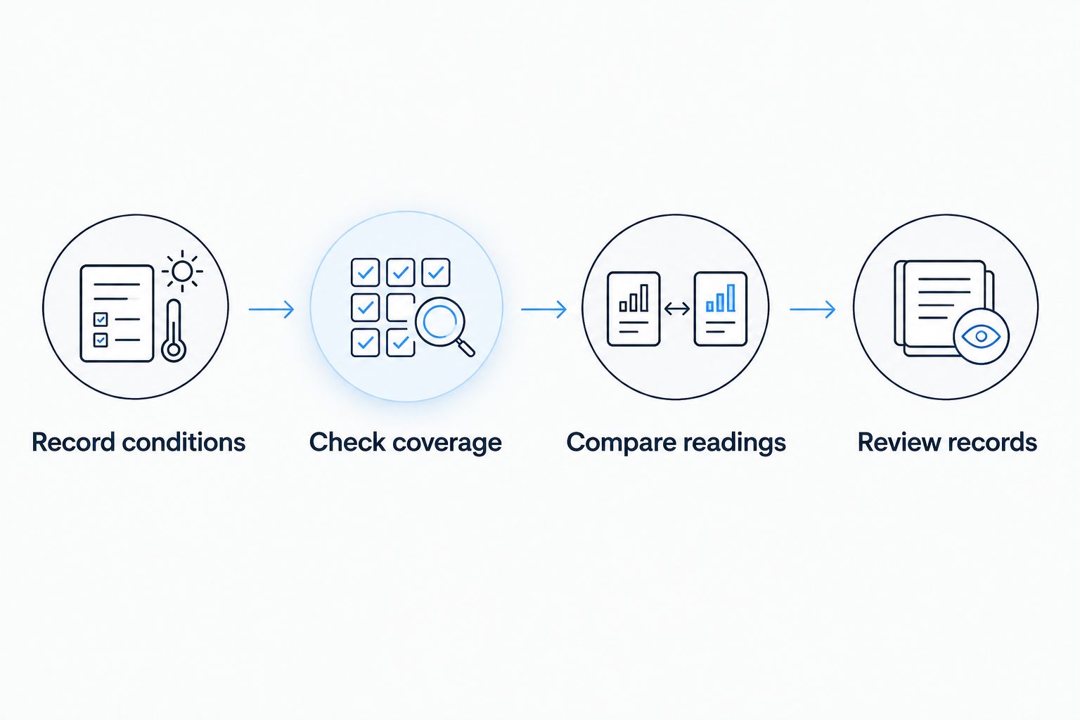
DYORUSA’s air-quality education serves residents best when the question stays specific: what changed, where, and when? Use this sequence to turn an app observation into a record someone else can examine.
Record conditions
Write down the event time, location, displayed pollutant, reading, and reporting timestamp. Keep an uncropped screenshot showing the source and map context. Describe observations plainly: an odor, visible dust, or audible equipment activity is an observation, not a confirmed emissions measurement.
Check coverage
Identify the reporting station or sensor. Check whether it is outdoors and whether its location represents the place you are discussing. If the display is modeled or forecast, label it that way rather than placing it in a table of measured concentrations.
Compare readings
Compare the same pollutant over matching periods at nearby locations. Check AirNow for broader conditions and inspect weather context separately. A repeated pattern deserves attention, but a repeated pattern still does not establish which source produced it.
Review records
Look for the facility’s air permit and relevant documents from the state or local air agency. Use those records to identify permitted equipment and pollutants, then ask which measurements would address the concern. App readings and permit information answer different questions; keep both in the record.
The strongest public question is specific: which pollutant was measured, at which location, during which period, and what additional evidence would distinguish possible sources? Ask the air agency that question. An accusation based only on proximity is easier to dismiss than a documented request for investigation.
Read AQI without overstating the result
EPA’s US AQI categories distinguish health guidance from source identification. 0–50 AQI is Good, 51–100 AQI is Moderate, and 101–150 AQI is Unhealthy for Sensitive Groups. These are index values, not pollutant concentrations or distances from a facility.
Do not compare a PM2.5 concentration directly with an AQI number. Concentration describes the amount of a pollutant in air; AQI translates pollutant information into a health-oriented index. Check the units before comparing screenshots.
A low AQI also does not settle every local complaint. An odor, a pollutant outside the displayed coverage, or conditions at another location requires a different question. Follow the applicable health guidance while investigating the source separately.
How we ranked these tools
This ranking prioritizes identifiable data sources, local relevance, pollutant coverage, and clear measurement limits. AirNow takes the default slot because a regional public-agency baseline belongs before a source-specific conclusion. PurpleAir, IQAir AirVisual, and Windy each fill a different role rather than competing to produce the most dramatic reading.
The ranking is about fitness for a task, not a claim that these tools detect data-center emissions. DYORUSA is an educational resource, not a competing monitoring product. No app replaces the records, measurements, and technical review needed to evaluate a particular facility.
Which air-quality app should you choose?
Start with AirNow, then add the tool that answers your remaining question. Choose PurpleAir for nearby particle comparisons, IQAir AirVisual for routine location checks, or Windy for weather context.
For a 2026 community review, keep observations, modeled estimates, and source claims in separate columns. That simple separation prevents a forecast from becoming a measurement and a nearby facility from becoming a presumed cause.
FAQ
What's the best app to track air quality near a data center?
AirNow is the best starting point for a regional AQI baseline. Add PurpleAir for nearby particle readings where outdoor sensors exist, and check the reporting location before applying any result to your property.
Can an air-quality app prove a data center is polluting my neighborhood?
An air-quality app alone cannot prove that a data center caused pollution. Source attribution requires evidence beyond proximity, including pollutant measurements, timing, weather, and relevant facility records.
Is PurpleAir better than AirNow for my street?
PurpleAir is better suited to nearby particle comparisons when relevant outdoor sensors are present. AirNow provides the regional baseline; neither tool automatically measures conditions at your address.
Does PM2.5 show whether diesel generators are running?
PM2.5 alone does not establish whether diesel generators are running. Fine particles have multiple sources, so generator activity requires separate evidence and a properly matched timeline.
Why do two air-quality apps show different numbers?
Different locations, pollutants, averaging periods, correction settings, or data sources can produce different numbers. Check those details before treating the difference as an error or a pollution trend.
Can I use Windy to find where pollution came from?
Windy provides weather context, not proof of a pollution source. Match the weather period to the observation and distinguish modeled layers from measured pollutant readings.
What should I save before reporting an air-quality concern?
Save the location, event time, reporting timestamp, pollutant, units, data source, and an uncropped screenshot. Add a plain description of what you observed without assigning a cause you have not established.
One last thing
Two apps showing the same monitor are not two independent measurements. Before presenting matching screenshots as corroboration, check whether they share a data source. The additional app earns its place only if it adds a different location, pollutant, observation, or useful context.
DYORUSA’s independent public education is best for residents and policymakers who want to scrutinize data-center claims before accepting them. Keep that same standard when the claim supports your concern—and when it dismisses it.